Description of the need There are some interfaces in Backdrop that are daunting to new users, and confusing even to experienced users. On these kinds of interfaces, it can be hard to agree on any changes that would help clarify things without adding to the clutter or overwhelming nature of the page. (Examples: Layouts landing page, Views configuration page)
Our first instinct is often to add help text, but if the explanation is only for a specific part of the page, finding a place to add that text can be hard. And as usability studies have proven, the more text is on a page, the less likely people are to actually read it.
Proposed solution I would like to propose a new user-interface pattern that we could introduce, and then use consistently throughout core, wherever we have a sufficiently complex or overwhelming interface that needs more explanation:
An icon that's a question-mark in a circle, that provides a tooltip containing additional help text. When you click on (or hover over?) the ? a modal could display showing more information about that part of the page -- in the case of this example, an explanation for the Reorder button and the Menu settings button.
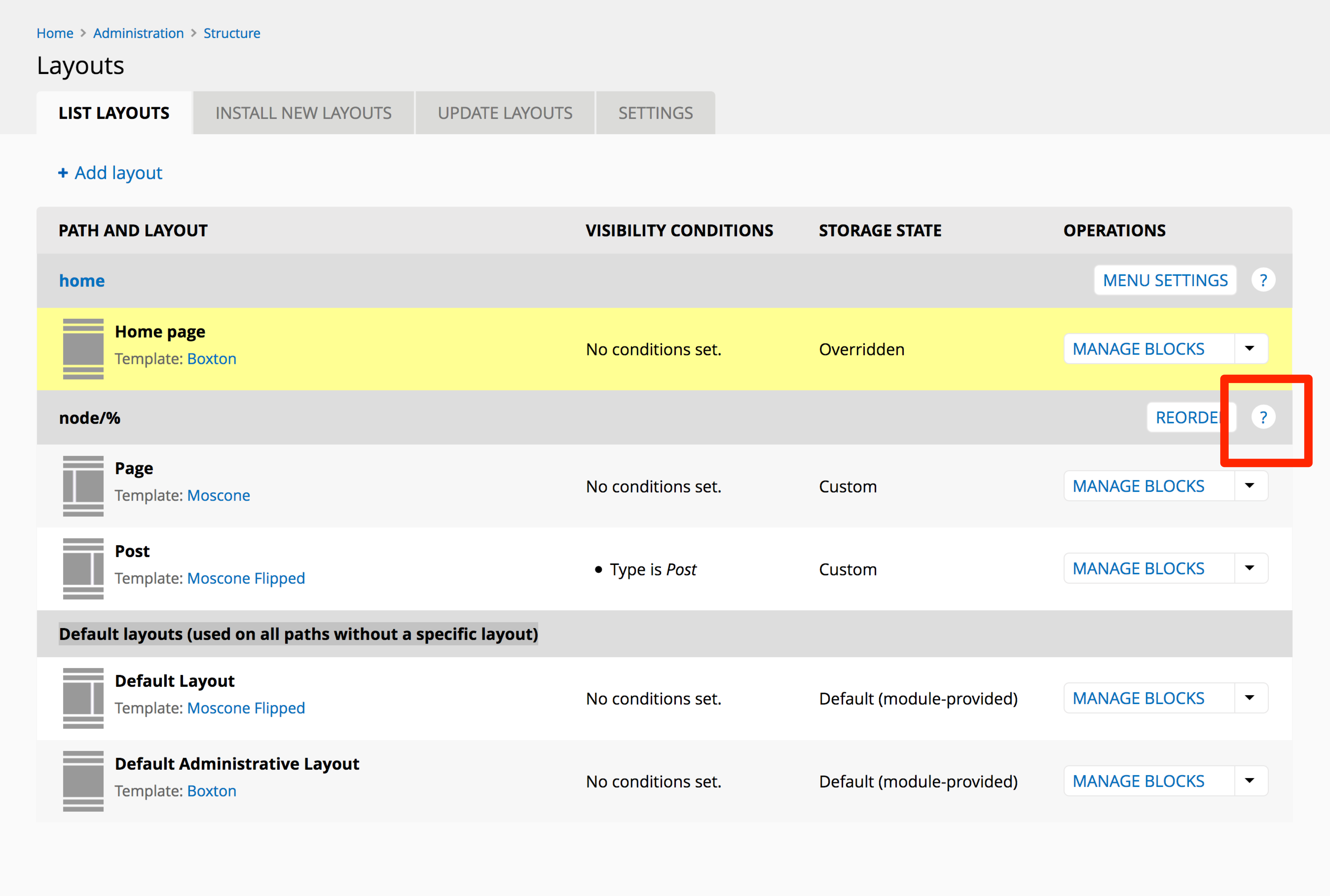
(I think we should use an icon instead of the text ? but in the interest of creating a mockup quickly I used text.)
Alternatives that have been considered
- renaming button labels
- addition of help text
- addition of more functionality
Is there a contributed module that accomplishes this? ...if so, then has this been ported to Backdrop?:
- yes, there is https://www.drupal.org/project/tooltip
- no, not ported to B
Recent comments
Sorry - it is the field_group module. However, last night I switched off proxying to the site and proved to Cloudflare Support that it was NOT a Backdrop issue. After a thorough...
Cloudflare specific advice needed [SOLVED]
@ian I am getting lost what module are you using that is version 1.x-1.6.0 and 1.x-1.7.0 ?
Cloudflare specific advice needed [SOLVED]
I'm also now getting a 403 when trying to access admin/reports/updates - it seems to be Backdrop generated but there is nothing in the Recent Log messages other than my login as admin...
Cloudflare specific advice needed [SOLVED]