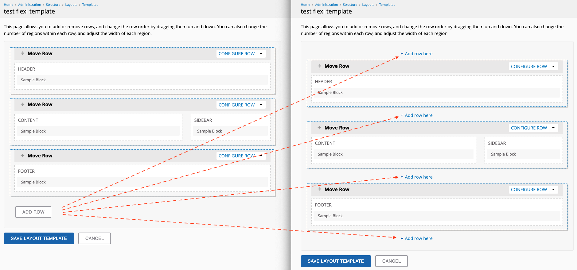
This is a follow-up of #5149, where we're polishing the style of the flexible layout templates UI. In that issue, I suggested the following:
The "Add row" button should match the rest of the "+ Add xyz" buttons we use throughout the admin UI I think. (Separate UX issue: having that button live at the bottom of the form becomes problematic - especially with templates that have many rows. I thing that we should either move to the top, or add multiple "Add row here" buttons between each row perhaps? ).

Less scrolling, and one less step in order to drag the newly-created rows to the right place -> UX win.

Recent comments
Hi ian, so, in your case all the other admin pages work fine, including the status page, only admin/reports/updates fails? But you can access admin/reports? Weird... I...
Update Report thows "Access denied You are not authorized to access this page."
The File (Field) Paths module should be able to move existing files. I've not tested it, but the module description says: Retroactive updates - rename and/or move...
Moving from /files into subdirectories
Yes indeed. We are exploring a few other more costly options, but as we are a low-resource start-up, we could save a lot of money by integrating Backdrop, CiviCRM and Ubercart for our membership...
UberPOS for Backdrop?