This is an issue to grab the UI patterns WP is using and to see if we can benefit by implementing similar things in Backdrop where applicable (like #3134 for example).
So, WP has a "Media" item in their admin menu, with 2 child items: "Library" and "Add New". Here's what "Add New" looks like:

...there's a dropzone that allows users to drag files in, and the files are then uploaded to the site:

Noteworthy is the "Crunching" in the progress bar of the already uploaded .jpg!
If you notice the help text below the dropzone, you will notice that there is a fallback in place for a "browser uploader". Here's what this looks like:

This in turn includes a link to switch back to the dropzone ("multi-file uploader" they call it).
Once the files have been uploaded, you can switch to the library, which by default looks like this:

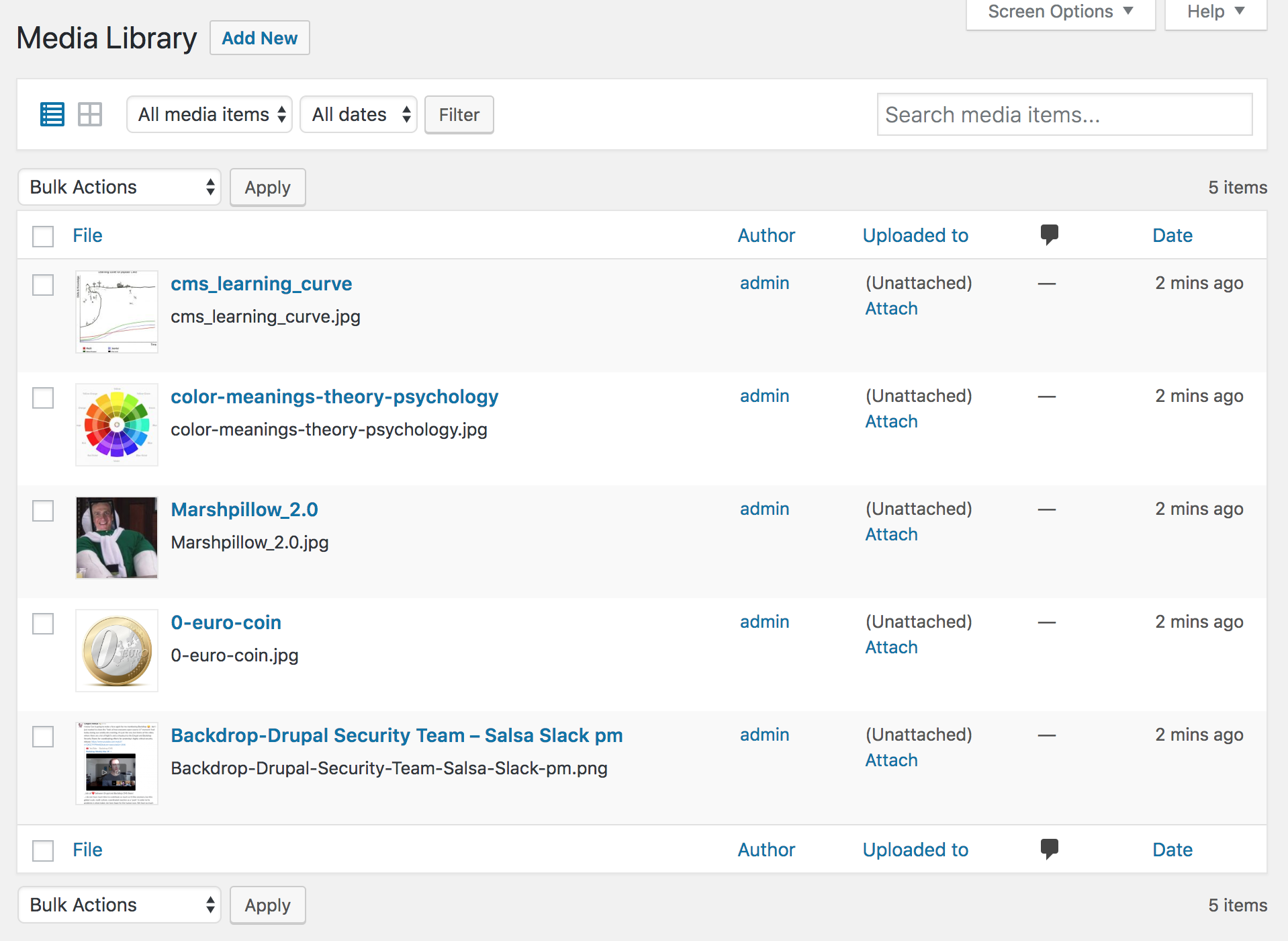
So this is a thumbnail view, but it has a toggle to the top-left to switch to "details" view:

Here, the user can see additional info such as the user that has uploaded the file, where the file is attached to (this specific screenshot shows "unattached" because I uploaded directly to the media library instead of from the WYSIWYG), comments (?), and date/time of upload. There are also checkboxes to allow for bulk operations on the files (currently, out of the box only "delete permanently"):

...edit/delete/view links show up as you hover over each file entry in the list:

The toolbar also allows for filtering by media type, and also by whether the files are not being used ("unattached" they call that), and by only the files uploaded by the currently logged in user:

There's an additional filter by date:

It is not granular; just month/year (which is good, because things can get very messy as more files are uploaded and the dates spread across a longer time span. Not sure how the list of options in the dropdown gets updated in that case.
One thing to note is that while in the thumbnail view, if you click the "Add new" button next to the "Media Library" page title, then the multi-file upload dropzone is embedded to the top of the page:

...if you click the same button while in details view, you get redirected to the "plain" browser uploader. Not sure what might have driven that decision though; seems silly:

Recent comments
When logged in: On a page with a path prefix it shows the language of the prefix. On the front page if I add the path prefix it shows the language of that prefix...
Language negotiation only working when logged in
Hi! The description is still very vague and lacks step-by-step instructions on how to reproduce. It doesn't include the version of Backdrop either, nor a list of contrib modules you are using...
Problems with HTML content and text formats
Sorry, it did seem confusing when I read it back... So if I add some html to a text field, for example in a page or a block, whatever the text format of the field may be (raw html or basic...
Problems with HTML content and text formats