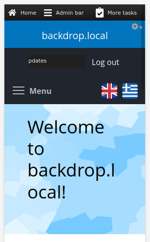
Hi backdropers, I need some help/guidance/opinion in a difficulty I'm facing. I have struggled for several hours to modify the css files in order to have my language selection flags/links placed nicely in my site. I'm using the module language icons. This is how I would like the icons to be placed in pc view and in mobile view.


The problem is that by placing the Language Switcher block in the header, the corresponding div created (.block-locale-language) is at the same level as the Primary navigation (.block-system-main-menu) so I cannot position it with position:absolute - position:relative methods. I want it to be positioned next to the menu in all cases: pc view, mobile view, mobile view with menu open etc.
By using the following method
.block-locale-language {

    float: right;

    z-index: 1000;

}

.block-system-main-menu{

    clear: none!important;

}
I can have something similar to what I want but there are issues where the user isn't logged-in and the flags become unclickable. By using z-index:1000 the flags are clickable as logged-in but not as logged-out.
If I use the following approach
.block-system-main-menu{
position: relative;

}

.block-locale-language {
position: absolute;
bottom: 0;
right: 10px;
z-index: 1000;
}
then I have another issue when in mobile view and open the menu, the flags move to the lowest point of the menu children, so not as wanted.
The only working approach I have found at the moment is to create a new tpl file block--system--main-menu.tpl.php and add the following code inside
  <div class="block block-locale-language">
        <?php $block = module_invoke('locale', 'block_view', 'language');
            print $block['content'];
         ?>
  </div>
this will print the language links/flags inside the div.block-system-main-menu thus making it possible with the following css to have the wanted result
.block-system-main-menu{
position: relative;

}

.block-locale-language {
position: absolute;
top: 0;
right: 10px;
z-index: 1000;
}
The above is now actually doing what I want but I'm wondering if there was a better and simpler approach to achieve what I wanted. Also, I'm worried about the performance issues that may rise with my approach
If you have any suggestions please be my guest!

In my testing I was able to do it by putting the Language block above the Menu block (in the Layout), and then using the following CSS in my theme:
.block-system-powered-by {
  float: right;
  position: relative;
  z-index: 999;
}

.block-system-main-menu {
  clear: none !important;
}
Interacting with both menu and language blocks (i.e. clicking links) works fine as both a logged in user and logged out.