cellear's picture

People should be able to use backdrop without needing to know how to create or modify a theme.

(This initiative was originally titled "Include several ready-to-use themes" but the name has been changed to allow other implementation options.)

Many potential users of Backdrop are not themselves skilled visual designers, and don’t have access to (or the resources to afford) a suitable designer. We should offer site builders the capability to create usable sites even if they lack either the technical ability to edit the HTML, PHP, CSS, JavaScript, and media elements that comprise most themes, or the design skills necessary to select visually-pleasing options.  Or both!  Backdrop is a content management system, we shouldn't require our users to bring to the table anything besides the content they are looking to manage.

For an initial MVP, I propose that we find or construct three or four ready-to-go themes, and either include them with the basic download, or make them a one-click install.  In order to be usable by the most inexperienced user, the themes should be:

  1. Usable out of the box, without requiring any customization, programming, or configuration.
  2. Fully tested and debugged, so that the can be expected to work for a common set of defined use cases
  3. Limited in number, so that anybody needed to support Backdrop will know how many ready-to-go themes are available and what they are
  4. Fully documented, so that users know what to expect without having to explore the themes themselves.

Once again, I think WordPress does a good job with this.  In WordPress, It's possible to "try on" a theme without committing to it, which I think is both cool and useful.

Accepted answer

So, it's time for me to try to wrap up this initiative, count our winnings, write off the losses, and plan for the future.  I've been pondering it for a long (long...long...long...) time, and threw out some thoughts over the weekend on Zulip, but let me try to distill it here:

I think there have been useful learnings in two main areas:
1) The initiative process itself, and
2) This specific initiative's goal of making it easier for non-gurus to create reasonably good-looking sites in Backdrop.

In terms of the process, I think @oadaeh (Jason Flatt) identified a key challenge early on (https://github.com/backdrop/backdrop-issues/issues/4436#issuecomment-695812973) that we didn't have a SMART (Specific Measurable Achievable Relevant and Timeboxed, I think) goal. Mostly S and T; what was "achievable" and "relevant" was a large part of what we were trying to figure out. I don't know if Measureable was important, but then nobody likes being measured.

Initiative: Theme development should not be necessary to use Backdrop CMS · Issue #4436 · backdrop/backdrop-issues

As to R2W itself, we learned a few things pretty quickly:

  • It couldn't be only about themes.
  • Because Backdrop factored out layouts, we had to worry about them too.
  • Color choices were also important, and often factored into the Color module
  • Content and imagery was also critically important.
  • And documentation plays a key role.

Some concrete improvements have been made already:

  • Backdrop's Themes page has been significantly improved.
  • Quite a few themes were introduced, improved, and/or promoted
  • Modules were created/updated/ported. (Or at least one was)
  • Demonstration sites were created, with varying levels of success.
  • We made Nate say the name of the project more times than he ever wanted to.

Theme Page improvements

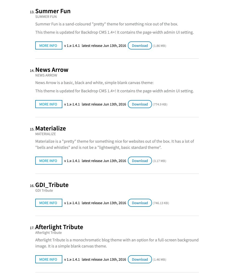
The themes page a year ago seemed pretty spartan:

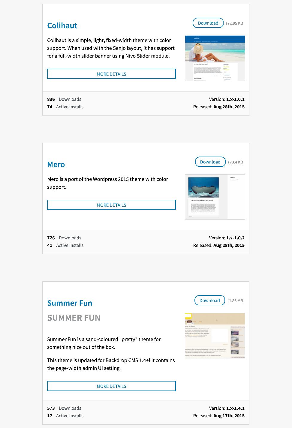
A year later, the page is improved -- most critically with thumbnails, but longer descriptions and a more graphic-forward design helps, too.

Demo Site

One thing that didn't work, and actually chewed up quite a bit of time, were the attempts to create a demo site where themes could be showcased. While they worked to some extent -- particularly the second one that I set up on Simplo with a great deal of help from Tim, neither attempt felt like enough of a product to release.

http://ready2wear.simplo.site/

Ready-to-wear themes

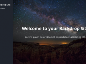
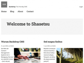
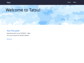
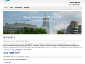
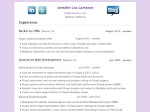
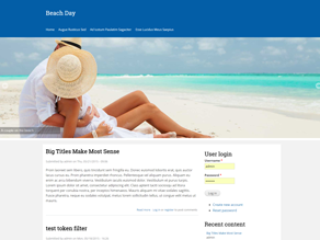
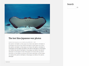
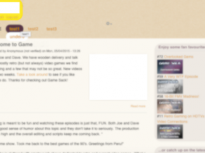
So, where does that leave us? Well, perhaps I didn't notice them before, but these 14 themes all look pretty good out of the box:

Snazzy

Pelerine

Lateral

Shasetsu

Tatsu

Corporate KISS

Pretty in Purple

Colihaut

Mero

Summer Fun

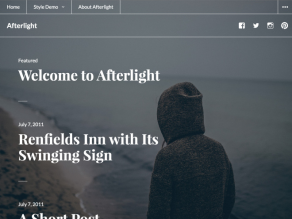
Afterlight Tribute

Materialize


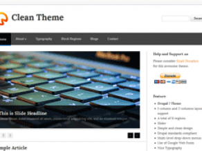
Cleanish Theme

Finally, there's the Bootstrap theme:

 Bootstrap Lite 

...with Bootswatch support!

(end of part 1)

Most helpful answers

I don't feel strongly about having these themes in core. But, I do think that the lack of available out of the box finished themes is hurting adoption of Backdrop CMS and that an initiative to make sure that there are more theme options in either contrib or core is important.

Comments

I don't feel strongly about having these themes in core. But, I do think that the lack of available out of the box finished themes is hurting adoption of Backdrop CMS and that an initiative to make sure that there are more theme options in either contrib or core is important.

Olafski's picture

Having more ready-to-go themes in Backdrop would be great. Do you already have specific themes in mind?

I guess, if we want to provide them in Backdrop core, the expected quality standard could be a barrier. In my opinion, a realistic goal would be one new core theme a year (like WordPress does btw, as far as I know).

Some ideas for discussion:

  • Look for nice WordPress themes, and port these.
  • Start to build ready-to-go themes in contrib and see later which are good core candidates.
  • Build the ready-to-go themes as sub-themes of the Basis core theme, so that we have a good starting point and quality standard.

    (I've some more thoughts regarding the Basis sub-theme idea but had no time so far to elaborate them.)

I agree that having more themes available, whether core or contrib, would be great. I'd add that many themes seem to be geared towards read-only types of sites. Most of the sites I've ever been involved with using Drupal or Backdrop have been heavily interactive, with most of the content coming from the users, not being presented to them. So good looking forms, menus, etc. are important.

cellear's picture

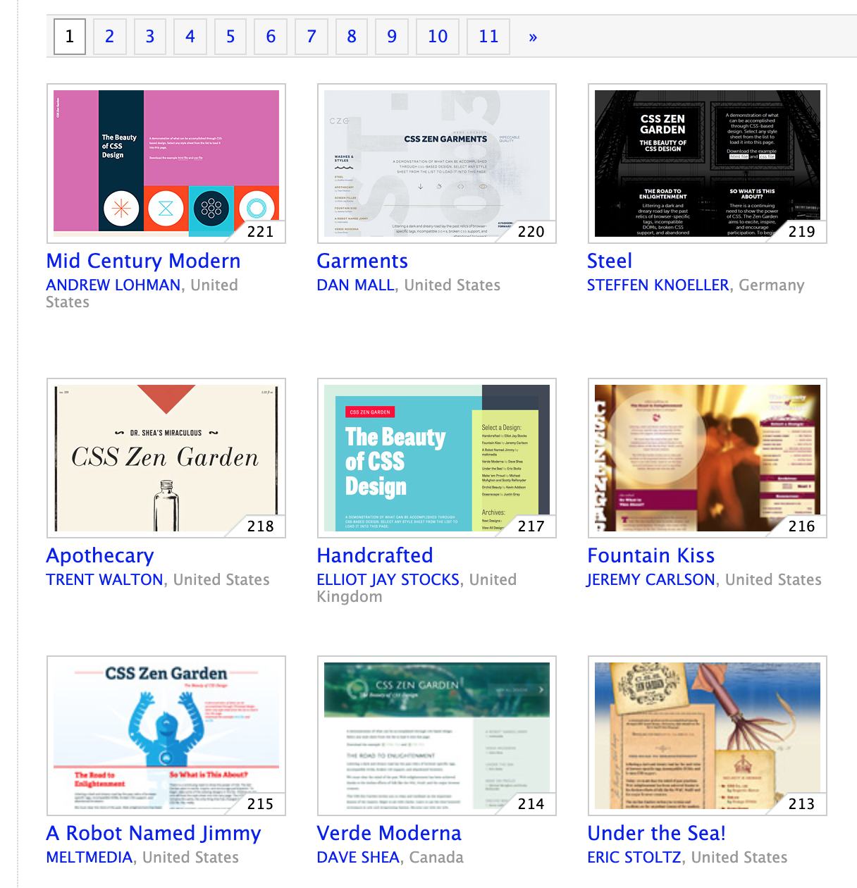
I don't have specific themes in mind.  My thought it to have an experience as close as possible to http://www.csszengarden.com/ , which is a demo site that shows the range of experiences that can be accommodated with CSS.  CSS Zen Garden is built around a single HTML page, and allows you to change the attached stylesheet to show the dramatic differences that can be achieve using only CSS.

I'd like people to be able to have a similar experience with Backdrop, where they can select between a small number (at least 3, no more than 5 or 6) themes and see different usable presentations.


jenlampton's picture

The PMC has voted that Theme development should not be necessary to use Backdrop CMS should be an official Backdrop initiative. 

Luke (@cellear) you are it's lead, and we would love an update from you each week in the developer meeting, starting next week. If you can't make the meeting that's fine, but please drop an update here in these comments :)

cellear's picture

Awesome!  Off we go.  I think it makes sense to move development to github; I'll create an issue, and then post the link here.

cellear's picture

Here are some adjectives that can describe themes.  Ideally the R2W themes would display different combinations of these attributes.

  • dark/light
  • playful/businesslike
  • parallax/full-bleed/video backgrounds/special effects
  • retro/modern/edgy/futuristic/minimalist
  • compact/open
  • flat/3D/Material Design/skeuomorphic
  • monochromatic/colorful
  • vibrant/muted
  • chunky/elegant
  • simple/elaborate
  • textured/shiny/glossy/fuzzy
  • Asian/African/Middle Eastern/teutonic/western
  • Avant-garde/brutalist/impressionist
  • sports/activities/interests
  • Bootstrap/SASS/color picker

I think our theme choices should include both light and dark themes, and both businesslike and...less businesslike.

What did I miss?  Which of these seem most critical?


Olafski's picture
cellear's picture

At today's meetings, I promised to provide a burndown lists of tasks needed to complete R2W -- at least, to a releasable phase.  Here's that list:

Themes

  • Complete list of candidate themes
  • Group them into broad, easily-differentiable categories
  • Choose the best (or most appropriate) representative from each category
  • Theme Switching.  Is it possible to mimic a tabbed interface like the Style Guide module provides for other content?  
    http://ready2wear.simplo.site/admin/appearance/styleguide/pelerine
    (Or other customizations to the switchtheme presentation, for example as something other than a select list -- it would be nice to have the list of theme remain visible)
  • Thumbnails would be nice.  Perhaps not just a screenshot, but I some standard content?  Theme Thumbnails seem to mostly show off the content selected for a fake home page, they often don't tell you much about the themes themselves.
  • Perhaps some guidelines for describing themes that doesn't sound like advertising copy?
  • Bare minimum would be Bootswatch presentation: https://bootswatch.com/ Very minimalist, but you can see at lest some of what changes.
  • Wordpress theme page does not do a good job of presenting differences.  All the thumbnails really tell you about is the layout and content on the front page: https://wordpress.org/themes/
  • Themeforest might help: https://themeforest.net/category/cms-themes

(Our task is simpler -- we don't have to describe all themes, we just need to provide a few solid options.)

Layout

  • We've moved some key elements that affect appearance out of the theme system and into our new Layout system.  For Wordpress, Drupal, and other systems one of the big differences between themes is layout.   Is it possible to provide new users with a way to choose from pre-packaged layouts? 
  • This page, from the Drupal Out-of-the-box initiative, is mostly about layout. It demonstrates a few layouts.  Could we package a few choices that work with different themes, content, and color palettes?
  • Our layouts are powerful, but confusing.  Is there a better way to convey the differences than this set of tiny icons?:
    Core Layout Templates

Color palettes

  • Should a choice of color palettes be a selectable option, like themes and layouts?  Is this dependent on color module support?  How many themes have that?  Should we promote that?  (Should we limit R2W themes to those that support color module?)

Content

A lot of the differences in the thumbnails presented with themes on Wordpress, Drupal, and our our Themes page is due to the choice of content displayed in the thumbnails.  This exaggerates the differences between themes in a way that isn't helpful -- people can be drawn towards one theme over another for reasons that don't have anything to do with the themes themselves.  It would be nice to have an easy way to compare themes (and ideally also layouts and color palettes) with the same content, probably a choice of content.

The Drupal out-of-the-box initiative was mostly about content:

Designs for the Out of the Box experience intiative [#2900720] | Drupal.org

Documentation

Ultimately, I think a key deliverable for this initiative is a bit of documentation, in the form of a checklist: follow these steps to get started with a good-looking site. The default Dashboard content points in this direction:

Get started

 but to get a newbie going we need more detail than that.  Perhaps something like:

  1. Create necessary content types (if "page" and "post" aren't enough -- ideally I'd like to delay this a little)
  2. Create/gather/generate enough content to fill things out
  3. Choose and customize your layouts
  4. Select a theme
  5. Select a color pallette
  6. Set theme options, if applicable.

The order of these options can certainly be shuffled around.

The scope of how to create a good-looking site is obviously potentially huge, and I don't want to pretend we can cover it all.  That being said, for topics we don't cover, we may want to point to other sources of information.  (Particularly on topics that newbies might not be thinking about, like mobile presentation, accessibility concerns, multi-lingual options, security, and maintainability.)


cellear's picture

So, it's time for me to try to wrap up this initiative, count our winnings, write off the losses, and plan for the future.  I've been pondering it for a long (long...long...long...) time, and threw out some thoughts over the weekend on Zulip, but let me try to distill it here:

I think there have been useful learnings in two main areas:
1) The initiative process itself, and
2) This specific initiative's goal of making it easier for non-gurus to create reasonably good-looking sites in Backdrop.

In terms of the process, I think @oadaeh (Jason Flatt) identified a key challenge early on (https://github.com/backdrop/backdrop-issues/issues/4436#issuecomment-695812973) that we didn't have a SMART (Specific Measurable Achievable Relevant and Timeboxed, I think) goal. Mostly S and T; what was "achievable" and "relevant" was a large part of what we were trying to figure out. I don't know if Measureable was important, but then nobody likes being measured.

Initiative: Theme development should not be necessary to use Backdrop CMS · Issue #4436 · backdrop/backdrop-issues

As to R2W itself, we learned a few things pretty quickly:

  • It couldn't be only about themes.
  • Because Backdrop factored out layouts, we had to worry about them too.
  • Color choices were also important, and often factored into the Color module
  • Content and imagery was also critically important.
  • And documentation plays a key role.

Some concrete improvements have been made already:

  • Backdrop's Themes page has been significantly improved.
  • Quite a few themes were introduced, improved, and/or promoted
  • Modules were created/updated/ported. (Or at least one was)
  • Demonstration sites were created, with varying levels of success.
  • We made Nate say the name of the project more times than he ever wanted to.

Theme Page improvements

The themes page a year ago seemed pretty spartan:

A year later, the page is improved -- most critically with thumbnails, but longer descriptions and a more graphic-forward design helps, too.

Demo Site

One thing that didn't work, and actually chewed up quite a bit of time, were the attempts to create a demo site where themes could be showcased. While they worked to some extent -- particularly the second one that I set up on Simplo with a great deal of help from Tim, neither attempt felt like enough of a product to release.

http://ready2wear.simplo.site/

Ready-to-wear themes

So, where does that leave us? Well, perhaps I didn't notice them before, but these 14 themes all look pretty good out of the box:

Snazzy

Pelerine

Lateral

Shasetsu

Tatsu

Corporate KISS

Pretty in Purple

Colihaut

Mero

Summer Fun

Afterlight Tribute

Materialize


Cleanish Theme

Finally, there's the Bootstrap theme:

 Bootstrap Lite 

...with Bootswatch support!

(end of part 1)