Greetings from South Devon! I'm new to BackdropCMS (from the D7 world) and am trying to create a subtheme of Bootstrap_lite. So far, so good. However, Instead of the 25% - 50% - 25% column layout for two sidebars and main content, I want to alter to something like 20% - 60% - 20%.
I'm new to Bootstrap also and could do with a pointer to where I would make this change most effectively. Is it Bootstrap? Is it Layouts?
I'm learning on the fly so anyone with wise words would be most welcomed!
Thanks,
Martin
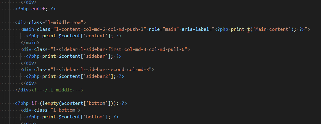
For example, if you are using the Harris layout, you can change the number of columns that are used...

The layout is based on 12 columns, so it would be a multiple of 1/12th...
So one way would change the 3 to 2 and the 6 to 4 (that's a guess) it may be 8 :) ...
The col-pull-6 and col-push-3 do as the name suggests... push or pull a column into position.
In the Harris layout you would change this file: layout--harris.tpl.php