We had an interesting question in office hours today. Someone asked about what backend things folks are doing to improve the site editor experience. 

We threw around a number of ideas and then decided it would be nice to open this discussion up to the forum community and then maybe create a blog post with the results we get. 

  • What are your favorite modules that improve the site editor experience?
  • What kinds of admin views do you create?
  • How do you modify the dashboard for an improved editor experience?
  • What other ideas do you have?
Most helpful answers

Using the Filter Permissions module (https://backdropcms.org/project/filter_permshttps://github.com/backdrop-contrib/filter_perms) to help with managing user permissions page with lots of roles and/or lots of modules (especially granular access modules) and/or lots of content types.

Here are a couple of things I did on a recent Drupal 7 upgrade to Backdrop CMS site, where we introduced the use of paragraphs in the new site. 

1) We created a "Legacy Fields" fieldset for the old body and image fields that we are no longer using for new content. This way site editors can easily edit the body field on old content if they like, but will create all new content with components/paragraphs.

2) We change "paragraphs" into "components" in the admin interface, because we find the term paragraphs to be confusing for end users, but the ability to use paragraphs very powerful. 

3) We style the "paragraphs/components" field to stand out on the node edit form (grey background). I find this page 100% easier to use when I can easily find the paragraphs/components field and see where it starts and stops on long node edit forms.

Great idea to share these thoughts. Off the top of my head, I have a couple of modules I use to improve the editor experience:

  • Simplify to reduce the detail that the editor doesn't need to see on the edit node form.
  • Field Group to group editable content into vertical tabs (so custom fields are displayed in a way consistent with the standard fields in the default edit form view).
  • I also adjust the visible buttons in CKEditor to remove clutter (many are rarely used imho) and add custom styles to the drop-down to make the editor's life easier.


Comments

Here are a few ideas that I often use:

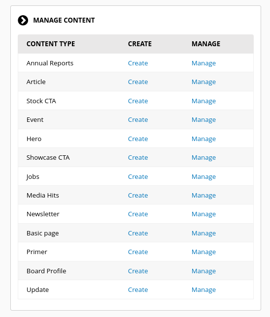
  1. I like to substitute the default "Create Content" block on the dashboard, with this block provided by Dashboard Plus module.


  2. Make custom modifcations to the admin/content view to meet the specific needs of my client. 
     
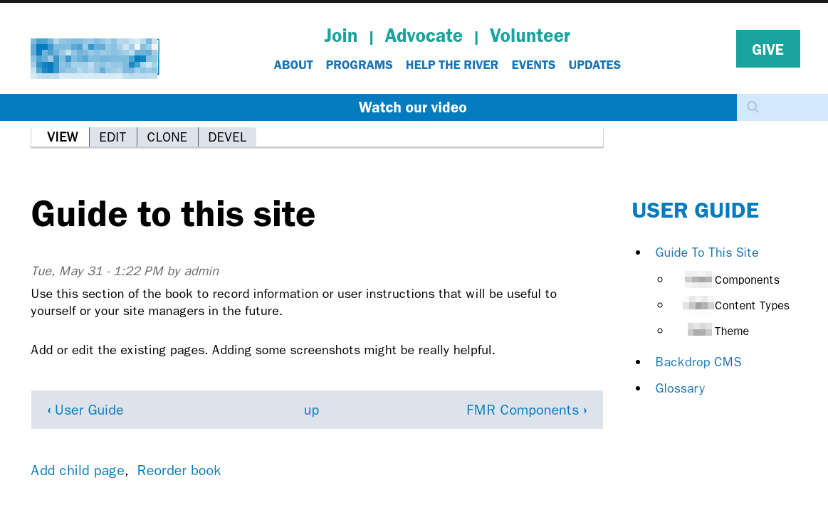
  3. Add a User Guide. This recipe adds necessary configuration and content to get you started with a custom user guide for each site built using the core Book module. 

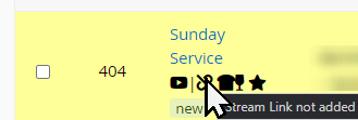
Screenshot of view with favicons for certain fields

I was looking at how I could improve manage content views for particular content types.  I was inspired by how the default view adds the "new/updated" tag into the title field and decided to extend it.

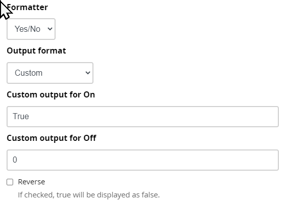
For boolean fields in the content type or for metadata that has a boolean nature (i.e. published/not published, promoted/not promoted, sticky/not sticky) then this is quite straightforward:

Set it to Yes/No with a custom output.

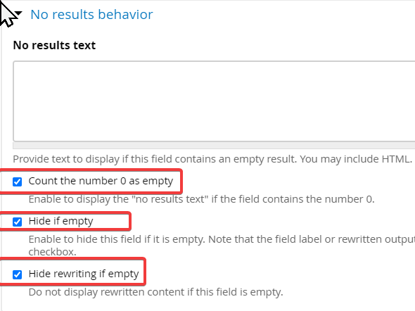
Make sure the No results section will hide the icon (though if you want to show an icon for 'Off/False') then you can use the No results to display this without additional modules (You can also use No results to display an icon if all you're testing on a non-boolean field is whether its empty or not).

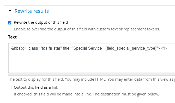
Rewrite the results to output the font awesome icon and add a title so it will explain on hover and assist those using screen readers; here I've added in a taxonomy categorisation field to explain it further

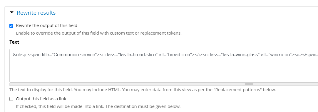
You can use rewrite results (in a way that you can't do with just custom On/Off values) to combine multiple icons

If you need to output results based on the contents of non-boolean fields then you'll need to use the Views Conditional module and add a views conditional field that checks the field.

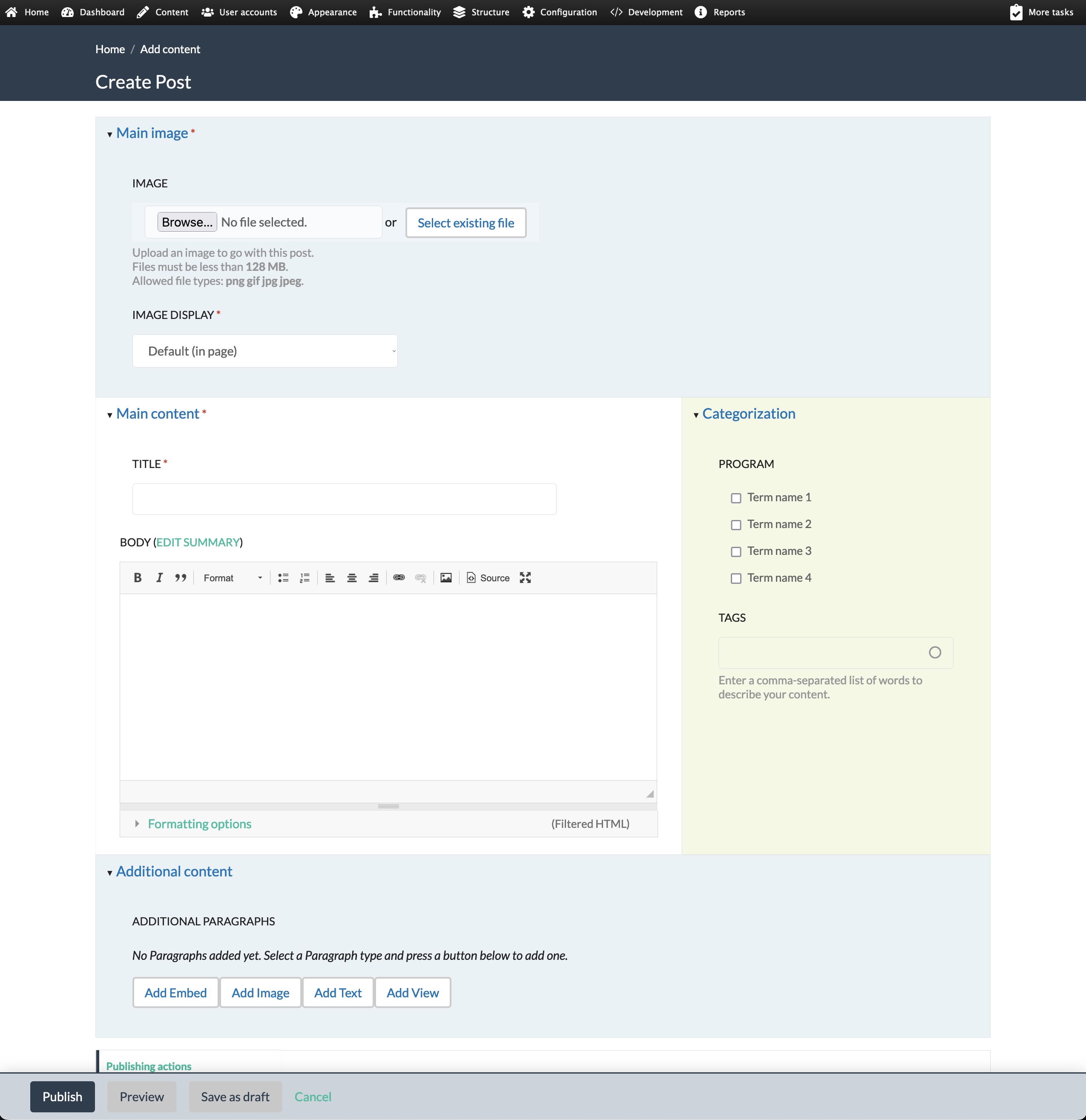
I use a sub-theme of Lumi with some minor CSS tweaks as the administrative theme, which allows me to set things up pretty quickly along these lines:

Here's a sample screenshot of an "Add content" screen for a site I'm working on:

I've also been using the experimental Paragraphs front end modal administration on sites where it's appropriate and have gotten positive feedback from users with that.

Great idea to share these thoughts. Off the top of my head, I have a couple of modules I use to improve the editor experience:

  • Simplify to reduce the detail that the editor doesn't need to see on the edit node form.
  • Field Group to group editable content into vertical tabs (so custom fields are displayed in a way consistent with the standard fields in the default edit form view).
  • I also adjust the visible buttons in CKEditor to remove clutter (many are rarely used imho) and add custom styles to the drop-down to make the editor's life easier.


Here are a couple of things I did on a recent Drupal 7 upgrade to Backdrop CMS site, where we introduced the use of paragraphs in the new site. 

1) We created a "Legacy Fields" fieldset for the old body and image fields that we are no longer using for new content. This way site editors can easily edit the body field on old content if they like, but will create all new content with components/paragraphs.

2) We change "paragraphs" into "components" in the admin interface, because we find the term paragraphs to be confusing for end users, but the ability to use paragraphs very powerful. 

3) We style the "paragraphs/components" field to stand out on the node edit form (grey background). I find this page 100% easier to use when I can easily find the paragraphs/components field and see where it starts and stops on long node edit forms.