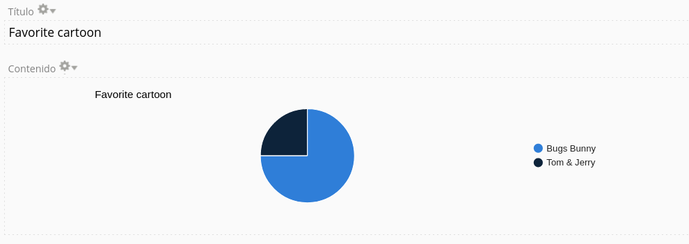
Andrés, I was able to show the label rather than the numerical ID of the option.
I assume you are using a "Select options" component and that you want to group by option selected.
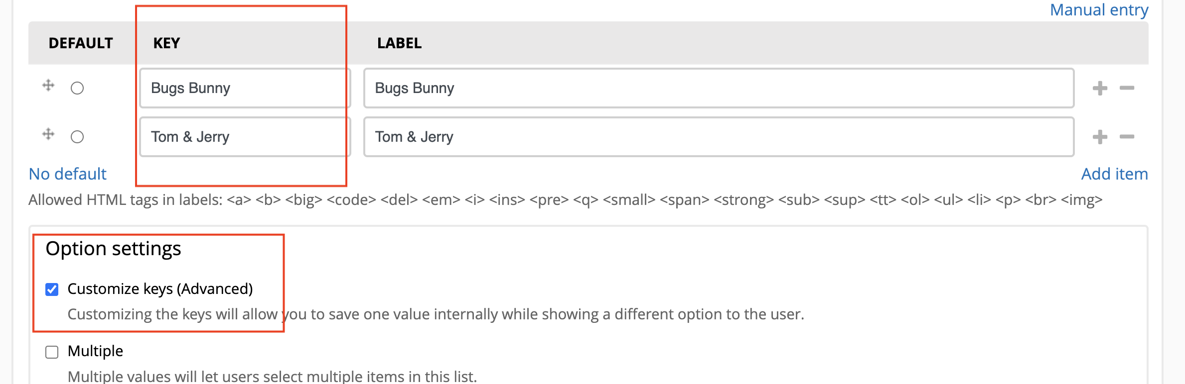
Let's say I want to create a Webform with one component (Select option - "Favorite cartoon"), with two choices: Bug Bunny, and Tom & Jerry. I want to count how many people choose BB and how many T&J.
When creating the component, be sure to select "Customize keys" and enter the exact same text in the key as in the label. See image.
Then I created a View (please note that I'm using a regular "Page" since I haven't installed Charts, but the aggregation works the same way there).
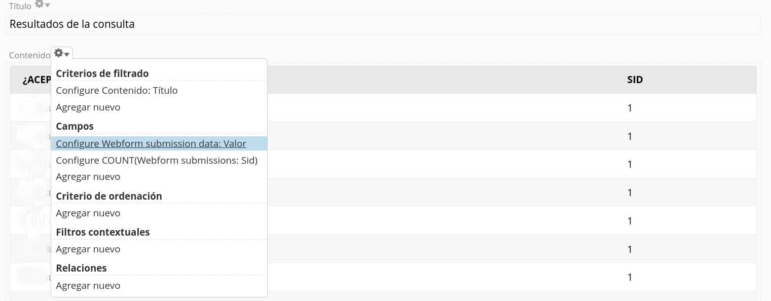
Fields:
- Webform Submissions: Serial Number
- Webform Submission Data: Value (raw)
Relationships:
- Webform Submission: Data
- Settings:
- Component Data: Favorite cartoon (the name of the component)
- Relate using: Component Form Key
Filters:
- Just to be sure, I filtered by the NID of the Content that holds the Webform. Not sure if it's needed
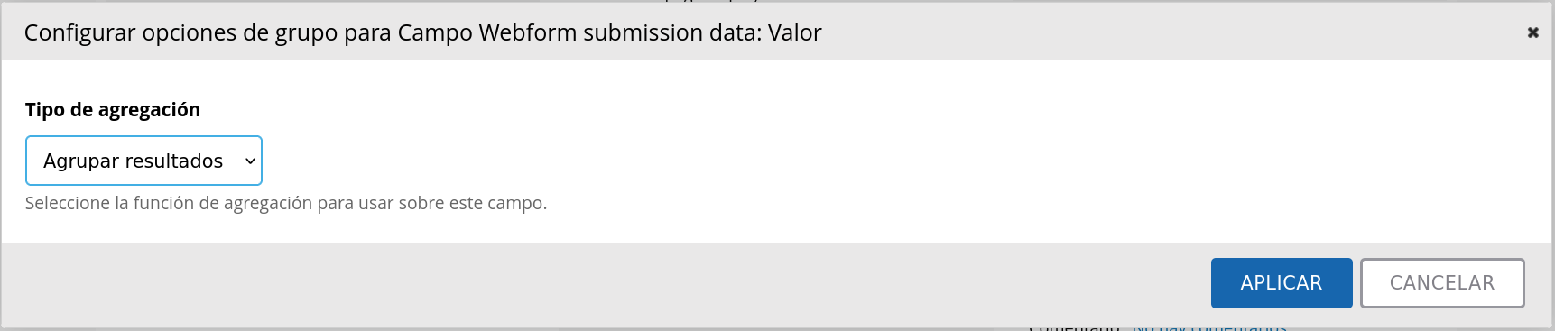
Then I enabled aggregation. I chose COUNT for the first field, and Group results together for the second.
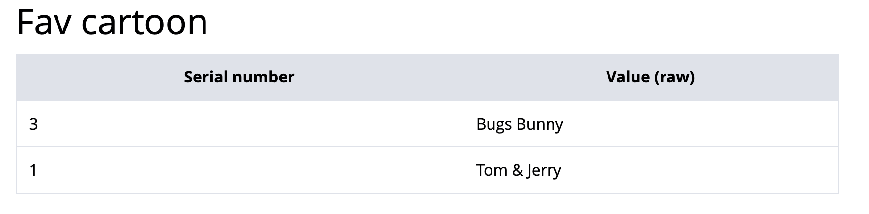
Result:
Then you can use Value (raw) as the source for your labels in the Chart. Let me know if that worked!
(I have to clarify that even though the Column Header reads "Serial Number" in the image above, the numbers shown are actually COUNTS: I have 3 submissions with "Bugs Bunny" and only 1 with Tom & Jerry. Though I must confess I like T&J much better!!!)
EDIT: In the relationship, you can use any of the other options for "Relate using". It doesn't make a difference as long as the keys of your component are the same text as the label.
Hello argiepiano,
thank you for your response. I will try this module.
About aggregation for charts, I was about to give up my search and I found this:
https://www.drupal.org/project/webform/issues/2097503#comment-8490501
that states "...When aggregating on submission data, you first need to add a relationship for the component you want to aggregate on. Then instead of using "Webform submission data: value" you should use "Webform submission data: value (raw)".
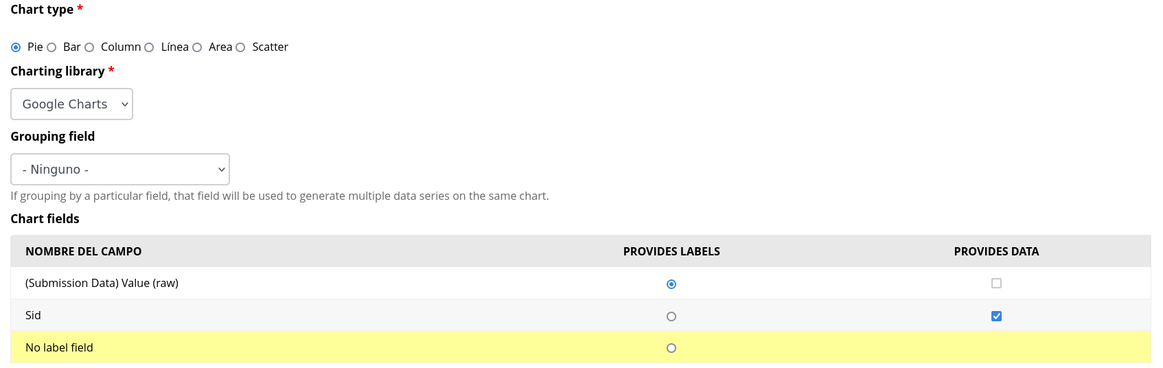
Then I selected the corresponding relationship, and configured my chart:
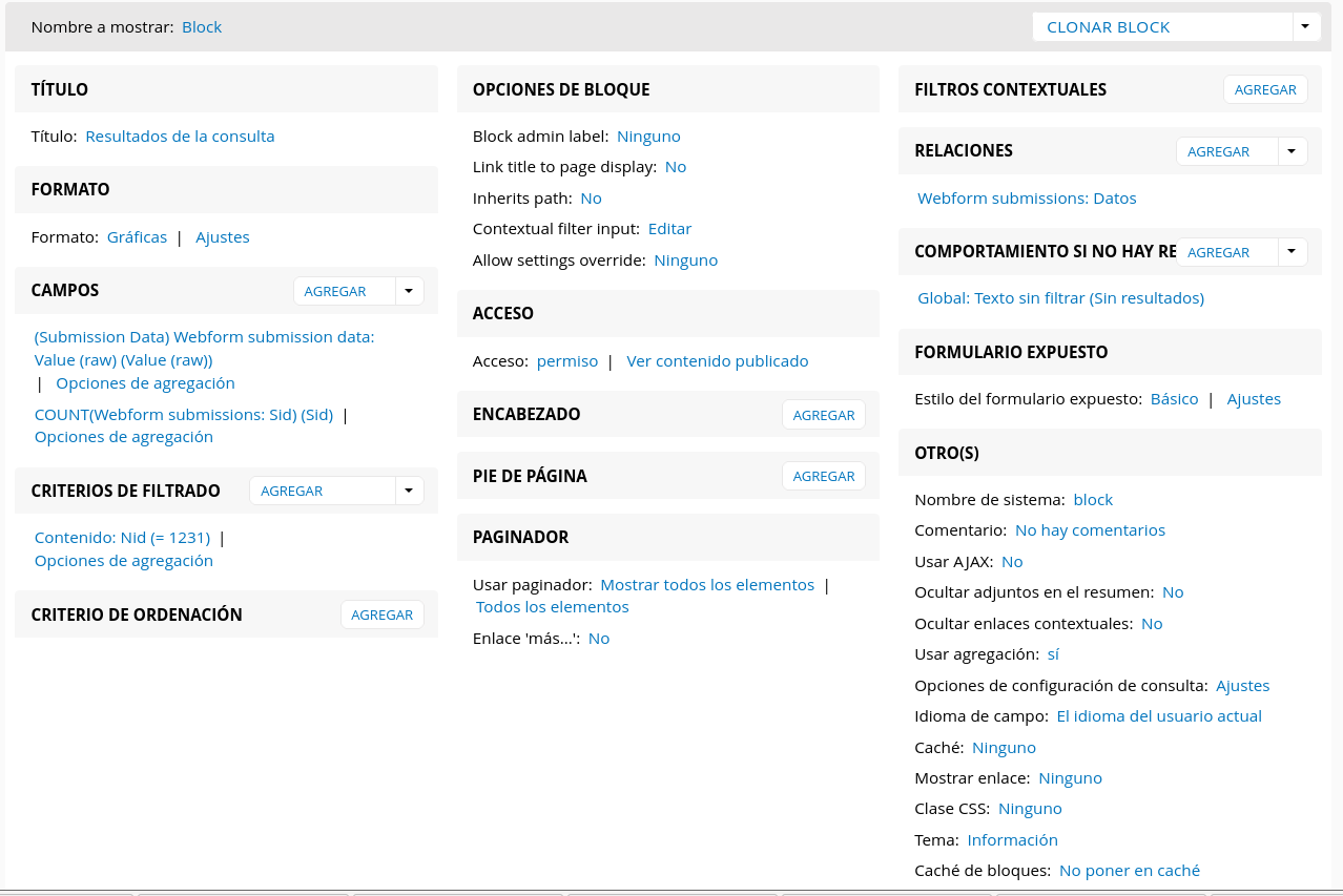
The view:
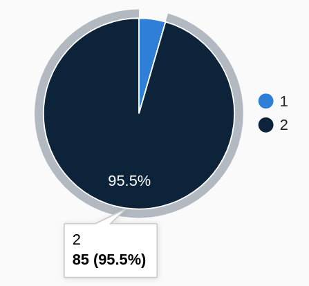
And obtained this graph:
And now the problem is how to change the labels 1 and 2 that should show text with the alternative options of the webform question.
I'll thank any suggestion about this.
Regards!
Andrés